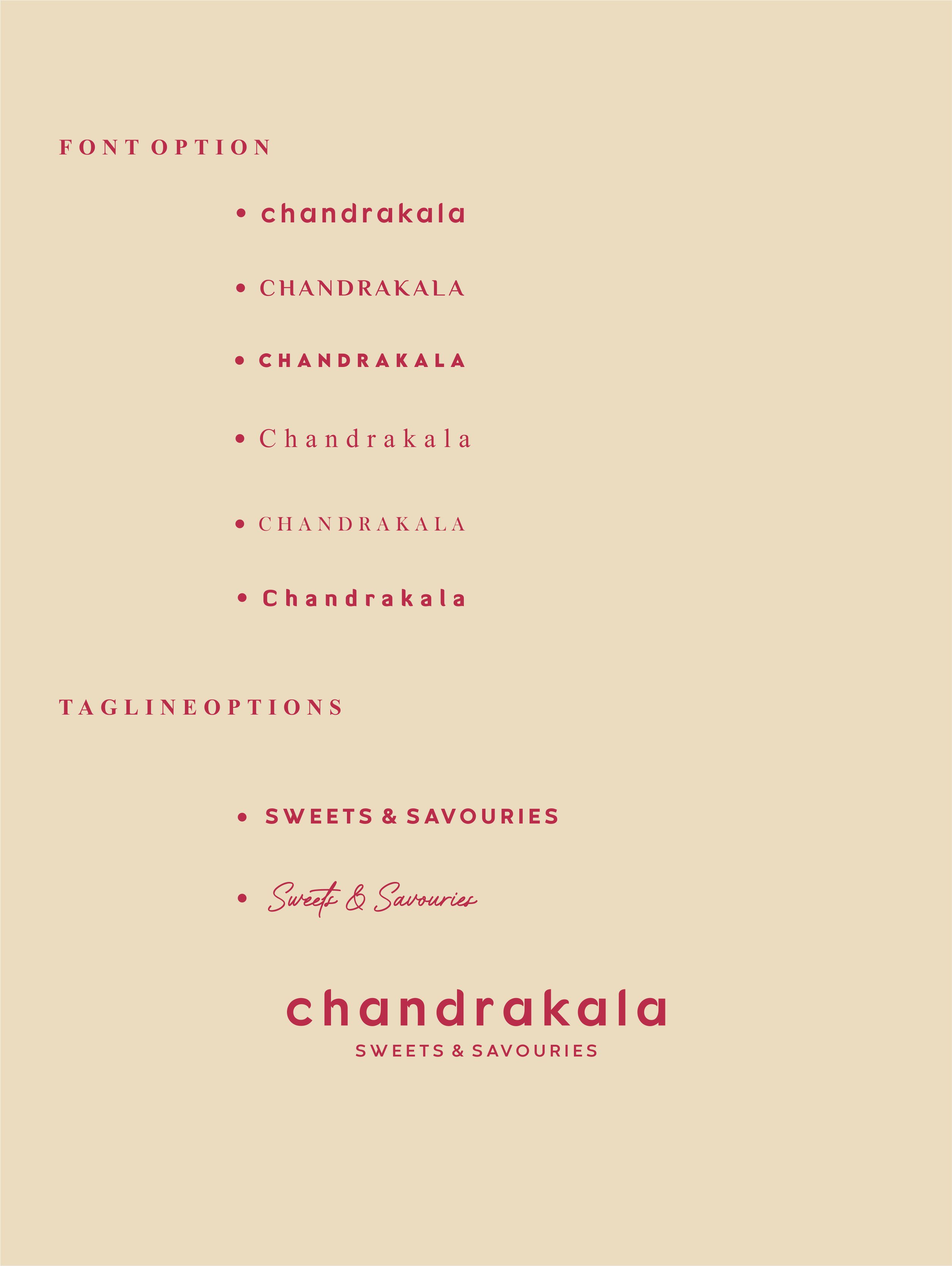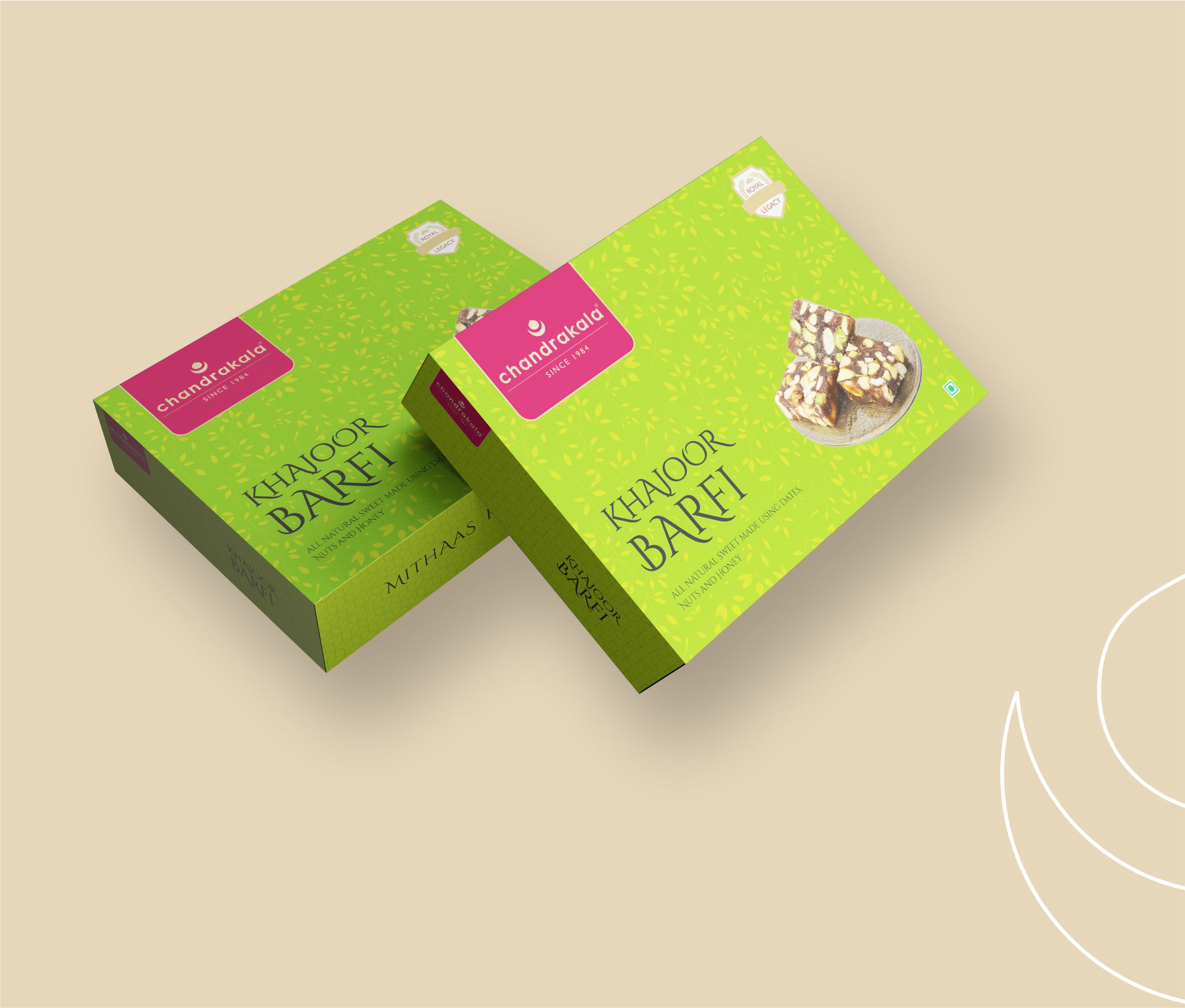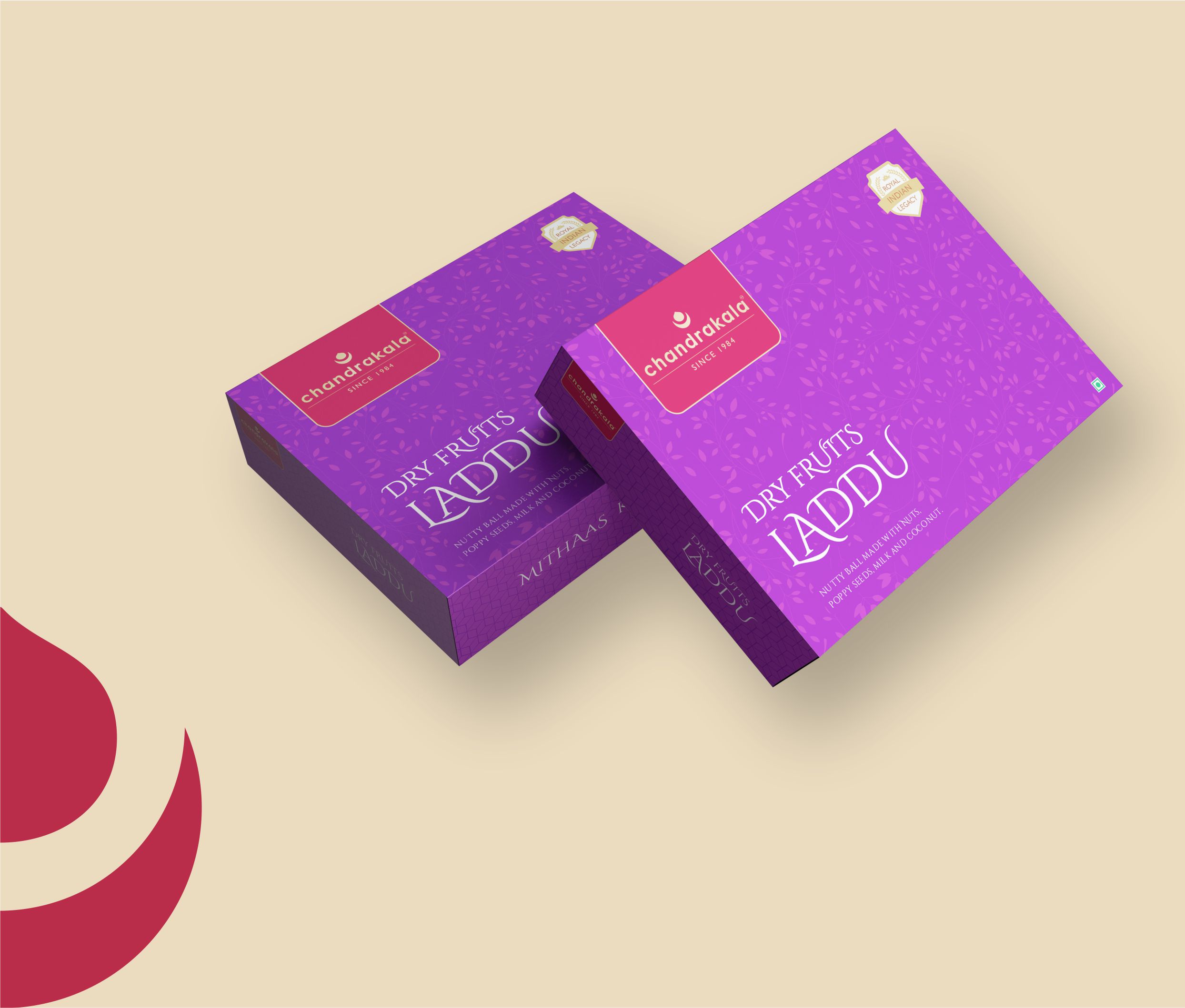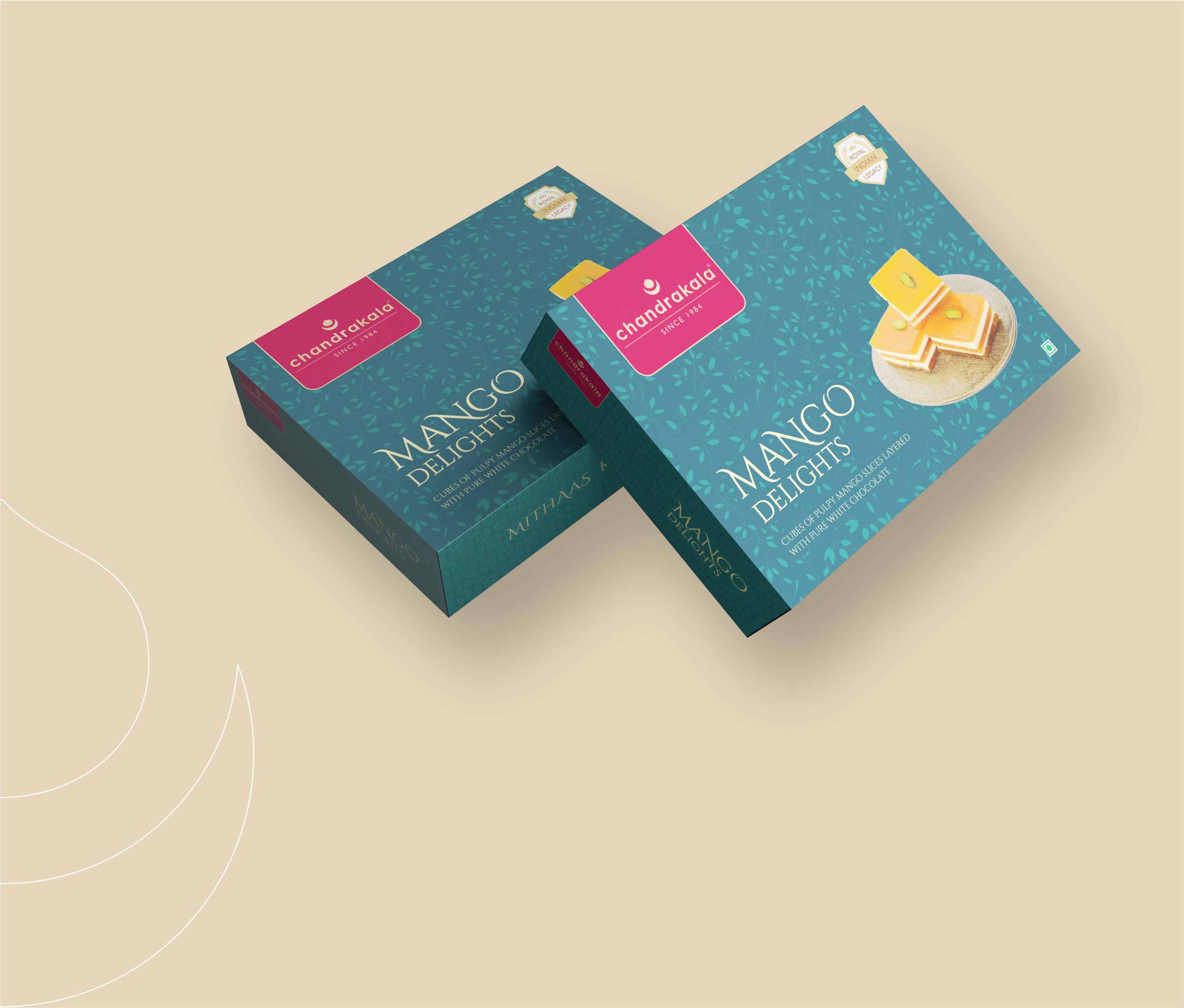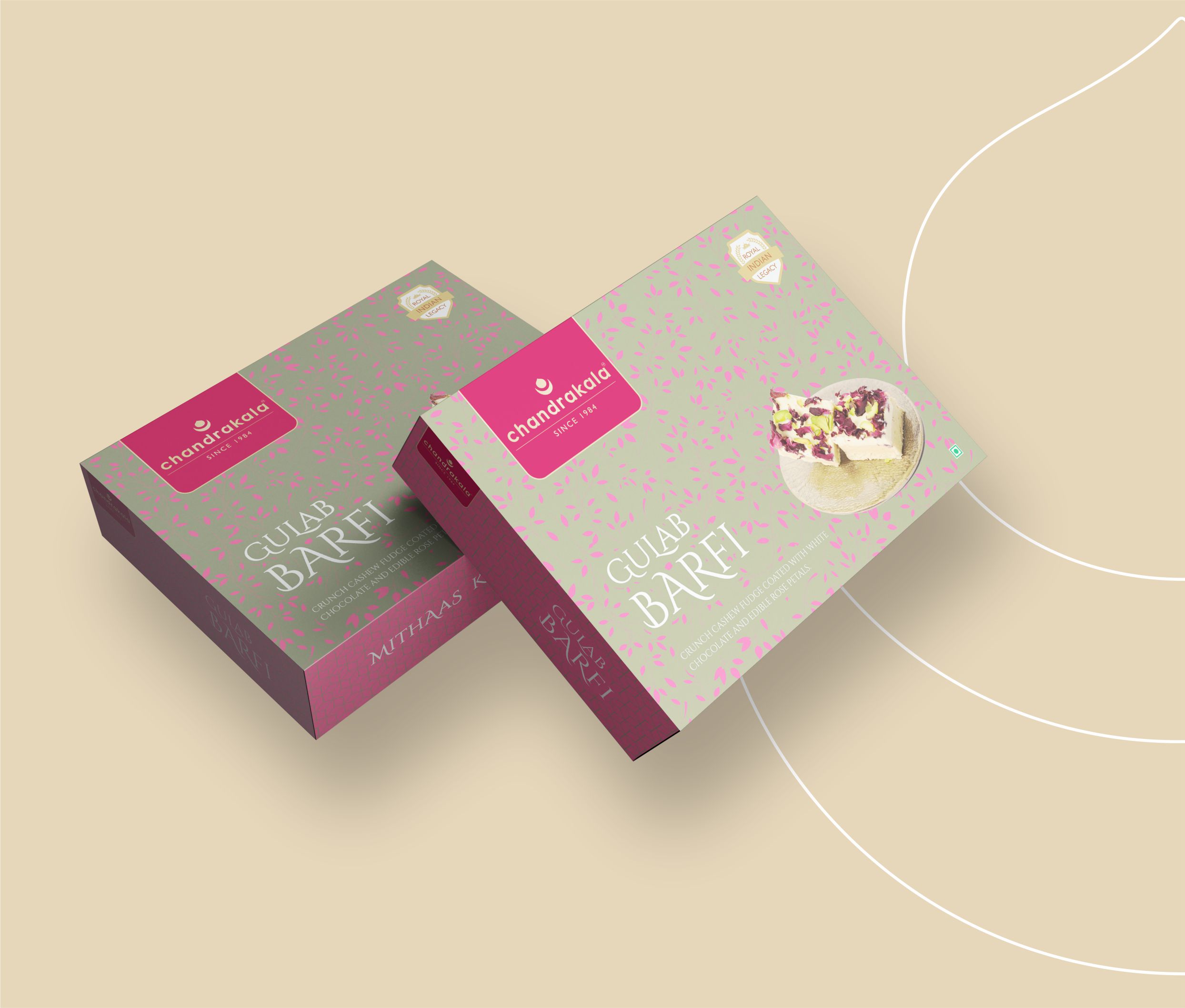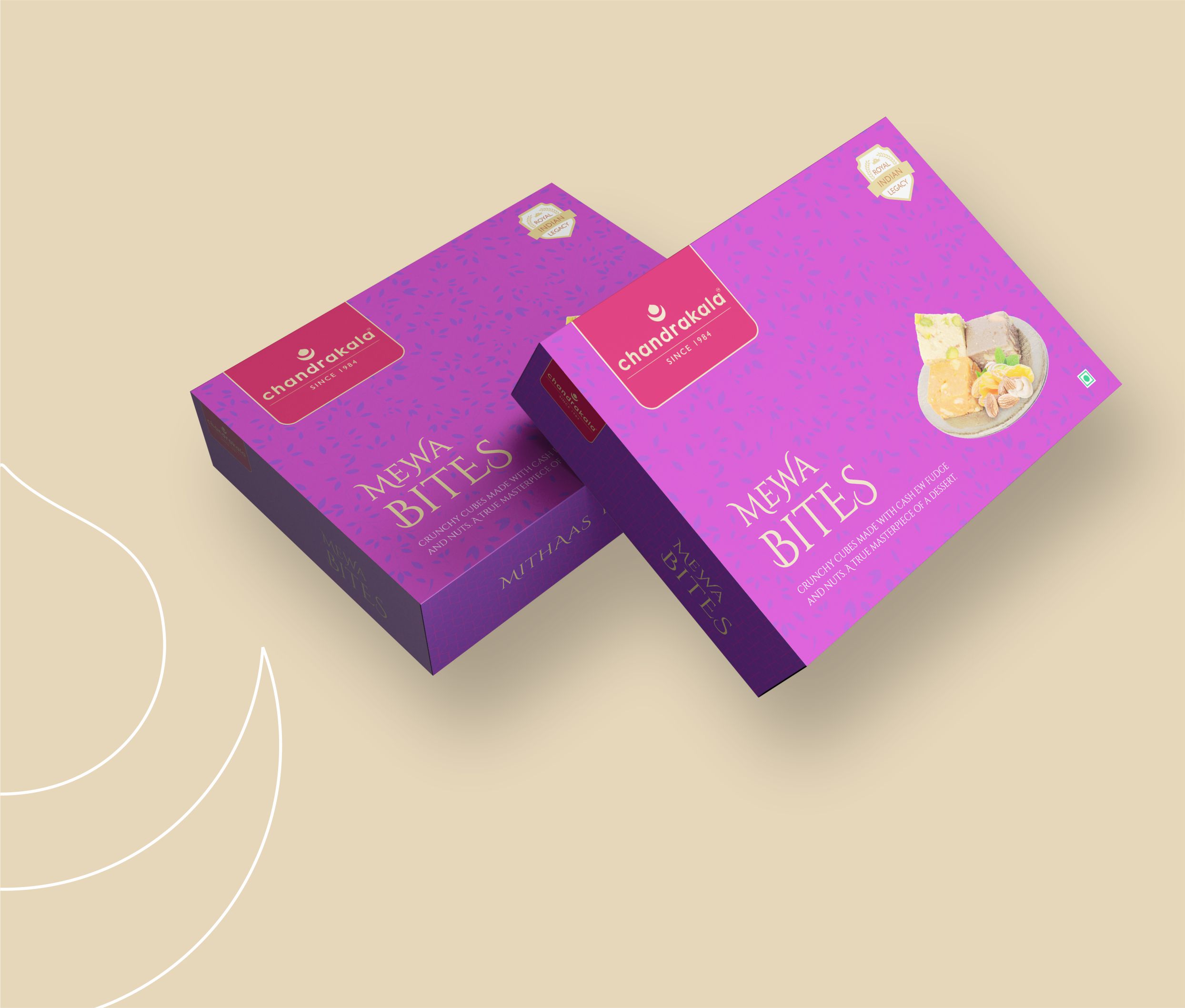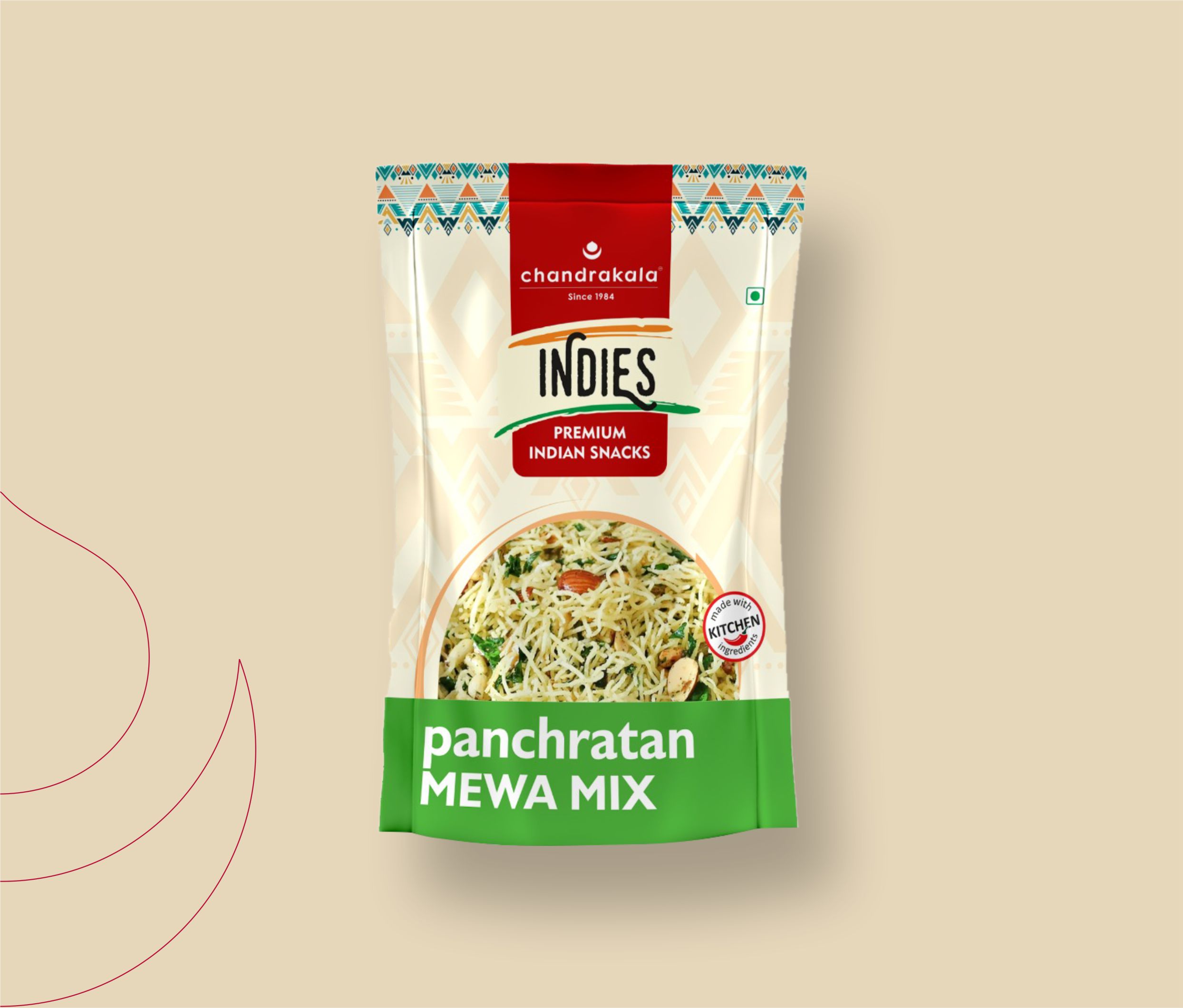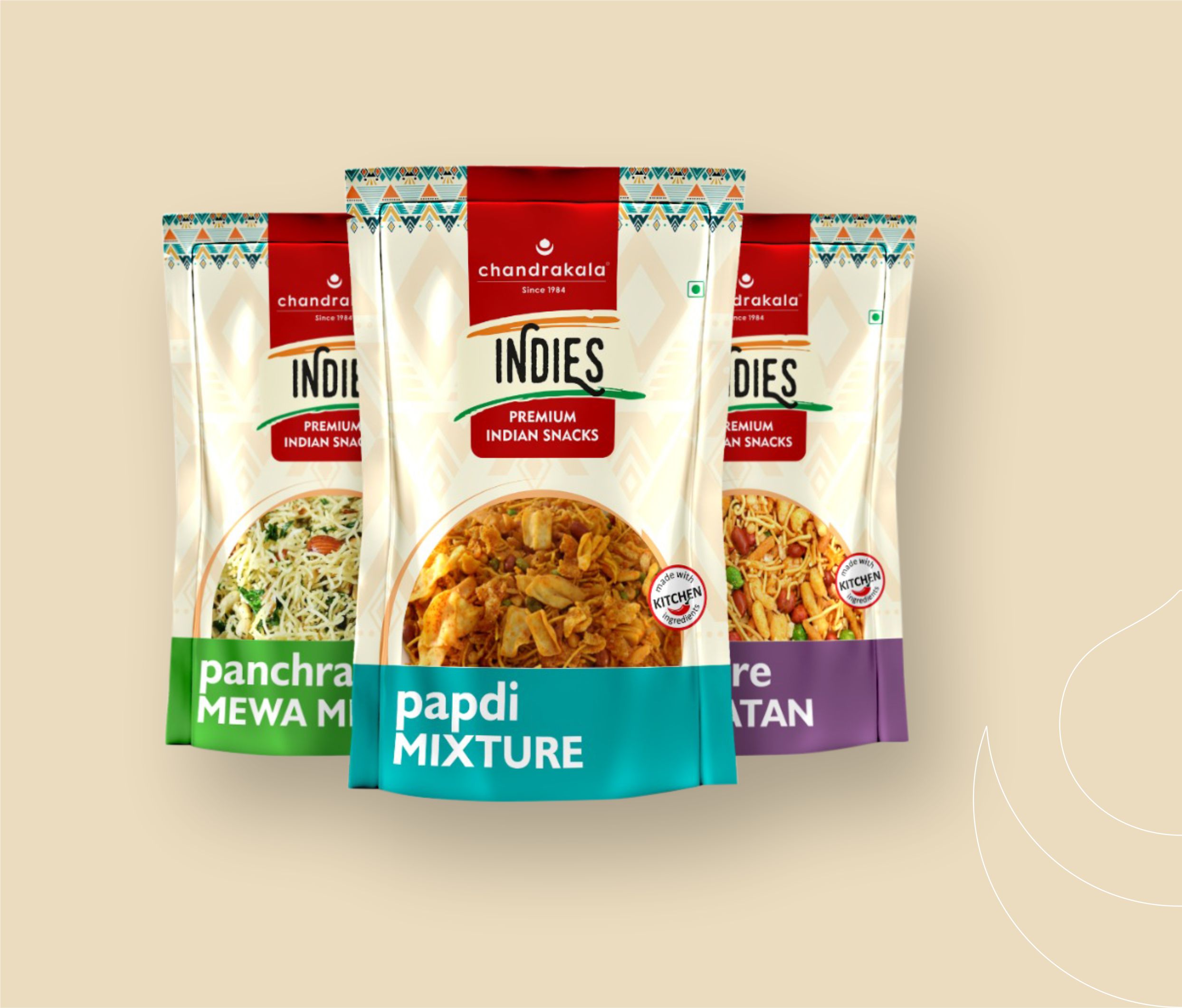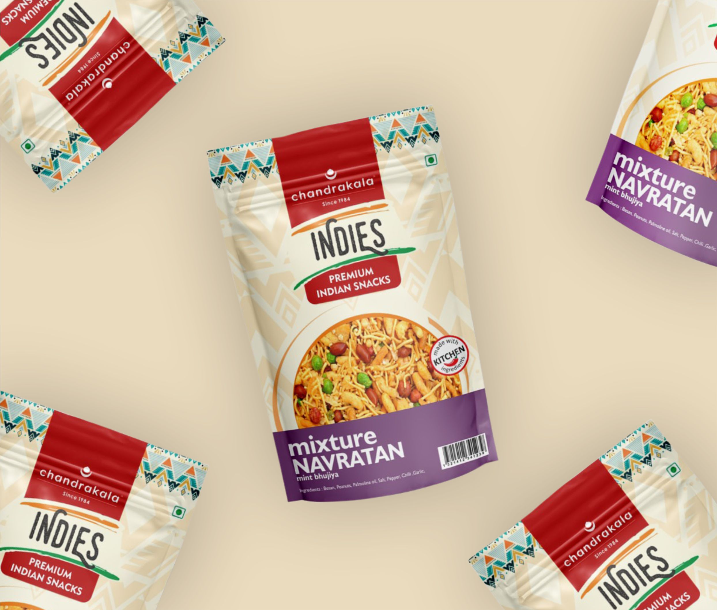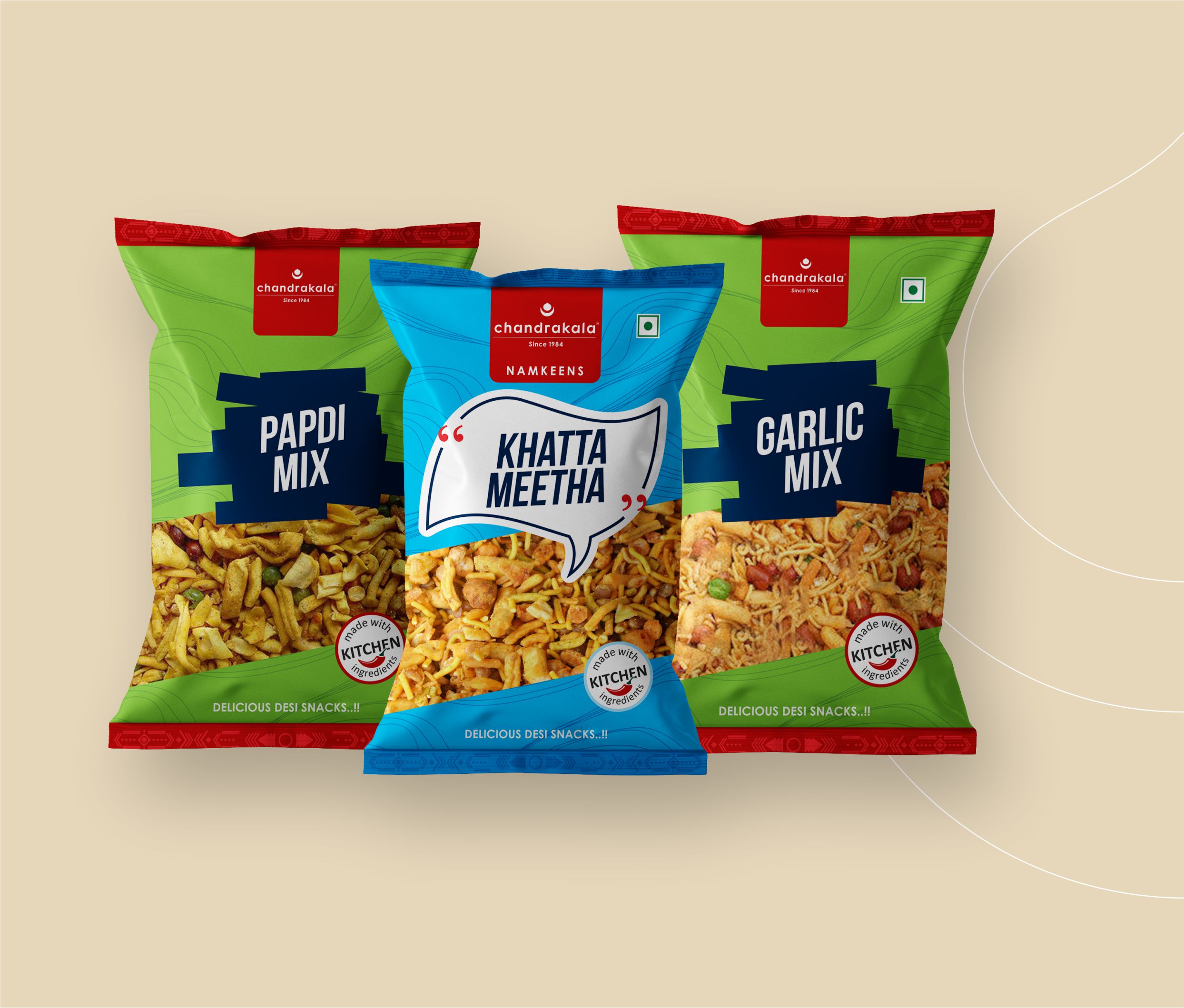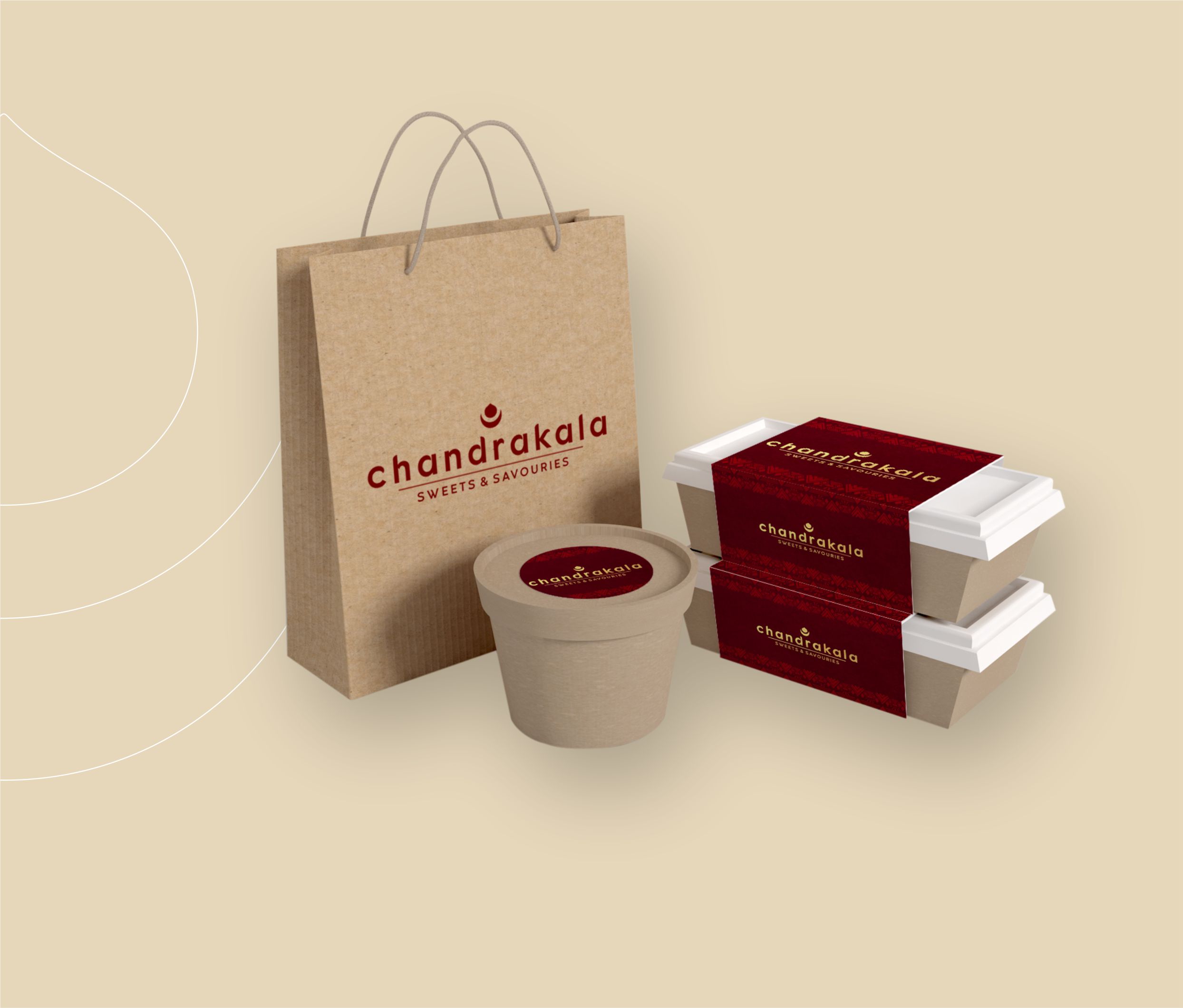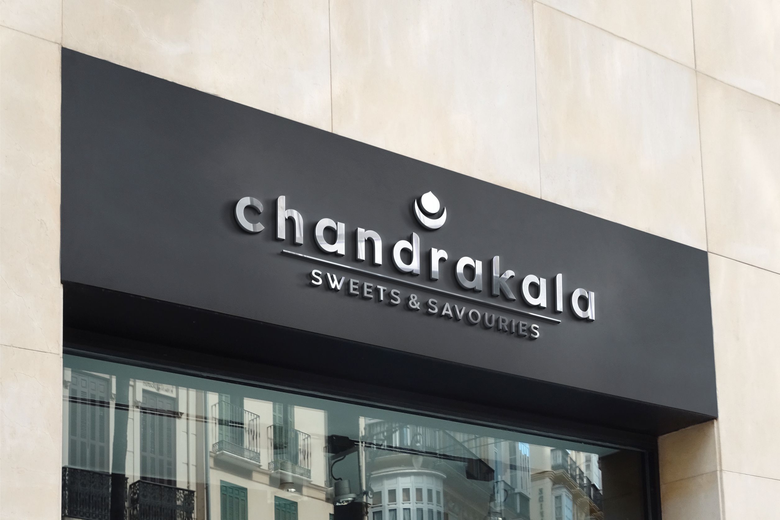
CHANDRAKALA SWEETS BRANDING
CHANDRAKALA Reviving a legendary regional brand of Indian sweets and savories and rebranding it to extend globally. The use of crescent moon justifies the brand name and reflects power of taste and balance of flavours that the brand promises. The symbol of drop and moon together gives a vision of Diya which imparts traditional ethos and elevates Chandrakala’s brand identity. The selection of font adds a classic impression to the complete design.